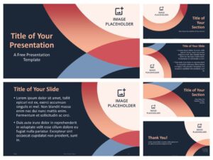
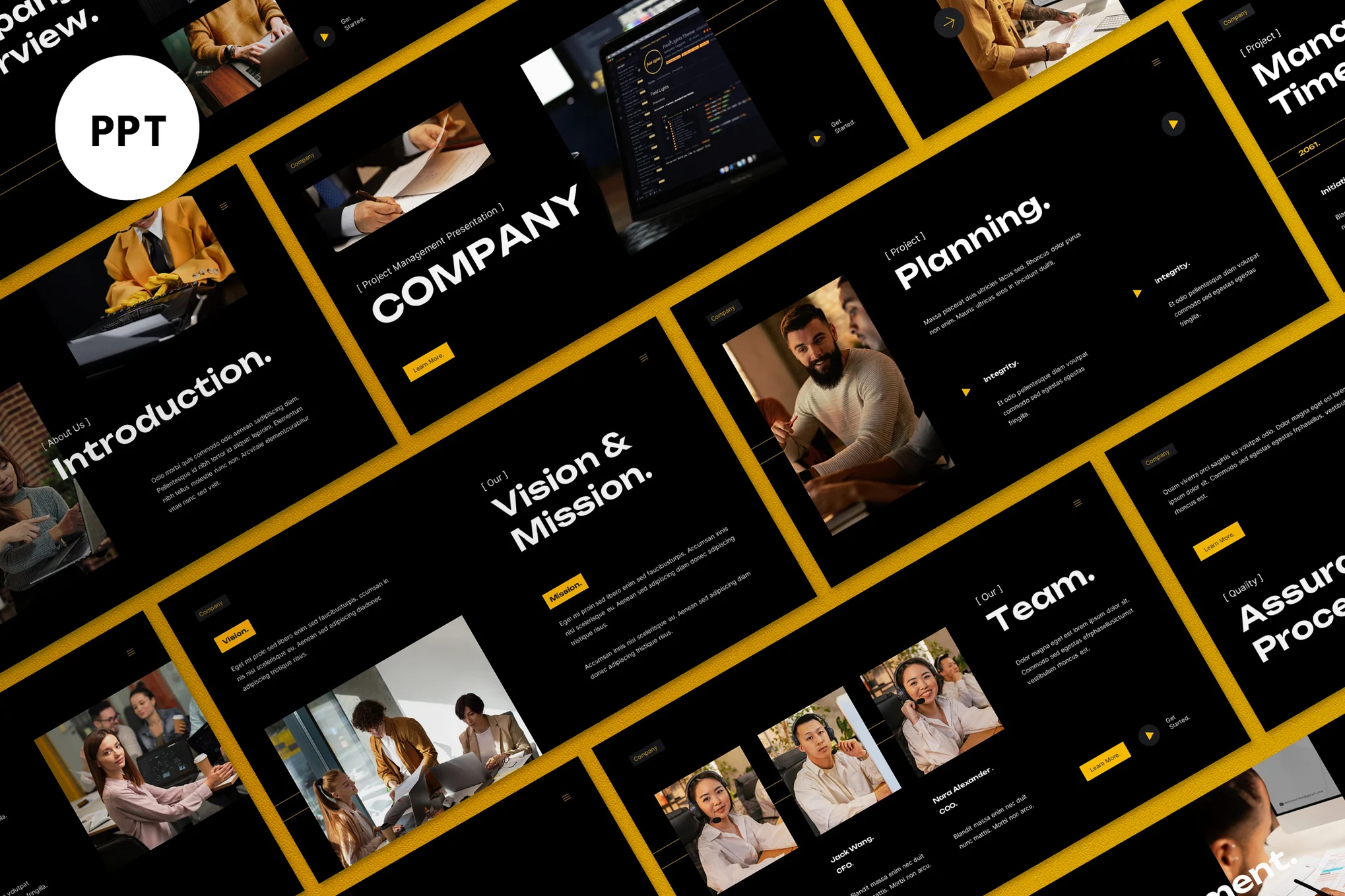
In the world of business communication, academic instruction, or professional pitching, presentations are a cornerstone. Whether you’re speaking to an auditorium of potential investors, addressing your team during a strategy session, or leading a classroom full of students, the quality of your presentation can determine your success. One of the most underappreciated yet crucial components of a great presentation is the template it is built on. The right PowerPoint template can elevate your message, add credibility, and keep your audience engaged. Conversely, the wrong one can derail your entire effort, distract your viewers, and undermine your confidence.
The significance of visual design in communication cannot be overstated. Humans are visual creatures—research suggests that people retain 80% of what they see and do, compared to just 20% of what they read and 10% of what they hear. This means that every visual element in your presentation—from fonts to color schemes, slide transitions to graphic choices—has an influence on how your audience receives and processes your message. And at the heart of these visual elements is your presentation template.
Let’s start with the ways a good template can enhance your presentation. First and foremost, it ensures consistency. When all your slides follow a coherent design language, the presentation feels professional and polished. Uniform heading styles, color schemes, and graphic placements reduce visual noise and make it easier for the audience to follow along. Instead of being distracted by sudden shifts in layout or strange font choices, viewers can focus on the message.
A well-designed template also enhances readability. Slides that are cluttered or poorly formatted can be difficult to read and absorb, especially for audiences viewing the presentation from a distance. Good templates prioritize legibility, using clean fonts, appropriate text sizes, and enough white space to allow the content to breathe. They offer a visual hierarchy—clear distinctions between headings, subheadings, and body text—that helps guide the audience through your points.

Moreover, the right visual aesthetic can emotionally prime your audience. Subtle color palettes can create a sense of calm and professionalism. Bold, dynamic designs can inject energy and excitement into your presentation. Depending on your purpose, a carefully chosen template can subconsciously influence how your audience feels about the content being delivered. This can be a powerful tool in persuasive presentations, such as sales pitches or investor briefings.
Branding is another critical area where templates shine. For businesses, consistency in branding across all touchpoints—including presentations—is essential. A branded PowerPoint template that reflects your company’s colors, logos, and tone helps reinforce brand identity. This not only improves recognition but also builds trust with your audience, who are more likely to view you as credible and reliable when your visuals are aligned with your brand.
On the flip side, a poorly designed or generic template can have the opposite effect. Templates that look outdated or are overloaded with unnecessary design elements can make a presentation seem amateurish. If your template is inconsistent, has alignment issues, or contains mismatched fonts and colors, it sends a message—intentional or not—that you’re not detail-oriented or professional.
Even worse, poorly chosen templates can distract from the message. For example, if you’re presenting serious financial data or making a case for funding, a colorful, whimsical design may feel out of place and make it harder for your audience to take you seriously. Similarly, templates with too many animations or transitions can detract from the information being presented, turning your talk into a disorienting slideshow rather than a compelling narrative.
Additionally, using common or overused PowerPoint templates may lead your audience to disengage. If they’ve seen the same layout in multiple other presentations, it can feel uninspired and lazy. This is especially dangerous when you’re trying to make a memorable impression, such as in a competitive pitch scenario. Originality and freshness can go a long way in capturing and retaining attention.
There’s also the danger of incompatibility. With so many different versions of presentation software and viewing devices, some templates might not render correctly across all platforms. Text might shift, images could break, and custom fonts might not load. These issues can destroy your presentation’s visual integrity and waste precious time trying to fix technical glitches on the spot.
This is why investing time—and in some cases, money—into selecting or customizing the right template is worth it. Rather than defaulting to the built-in options in PowerPoint or downloading the first free design you find online, consider what your presentation needs to achieve. Ask yourself questions like: Who is the audience? What tone should the presentation convey—formal, casual, energetic, serious? What type of content will be shown—charts and data, images, bullet points, or a mix?
Templates should serve your content, not dictate it. They are a foundation, not a straitjacket. The most effective ones are flexible enough to accommodate different types of content while maintaining visual consistency. They allow for slide variation without breaking the overall design. They come with pre-set layouts for title slides, section headers, image galleries, graphs, and tables, all styled to match seamlessly.
Another tip is to test your template with actual content before finalizing it. Sometimes a template might look good in a demo or preview but doesn’t support your information effectively. It’s important to load in your real data and images to see if the design holds up. For example, do your charts look clean and understandable? Does your content fit within the space provided without cramping? Are all the design elements helping to communicate the message—or are they just filling space?
When used correctly, PowerPoint templates can save you time and effort. They eliminate the need to design each slide from scratch and can help even those without a design background create attractive, professional-looking presentations. This ease of use is particularly valuable in fast-paced business environments where presentations often need to be created on short notice.
If design isn’t your strength, or if your presentation has high stakes, consider hiring a professional to create a custom template. A custom-built template will not only reflect your brand but also align with your specific content goals. It provides an edge in professionalism and visual storytelling that generic templates simply can’t match.
Ultimately, your presentation is more than just the words you say. It’s a holistic experience that combines your delivery, your message, and your visuals. The design of your slides plays a silent yet potent role in shaping audience perception. PowerPoint templates, while often overlooked, are one of the key building blocks of that design.
In conclusion, templates are not just decorative features—they are strategic tools. Choosing the right one can add impact, clarity, and professionalism to your presentation. Choosing the wrong one can confuse, distract, or even alienate your audience. Whether you’re creating a quick update or preparing for a high-stakes pitch, take the time to select or build a template that complements your message and reflects your intent. Because in the end, how you present is often just as important as what you present.
